Happy Publication Day to the German edition of The Art of Baking Blind.

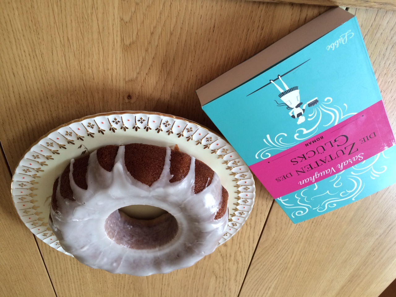
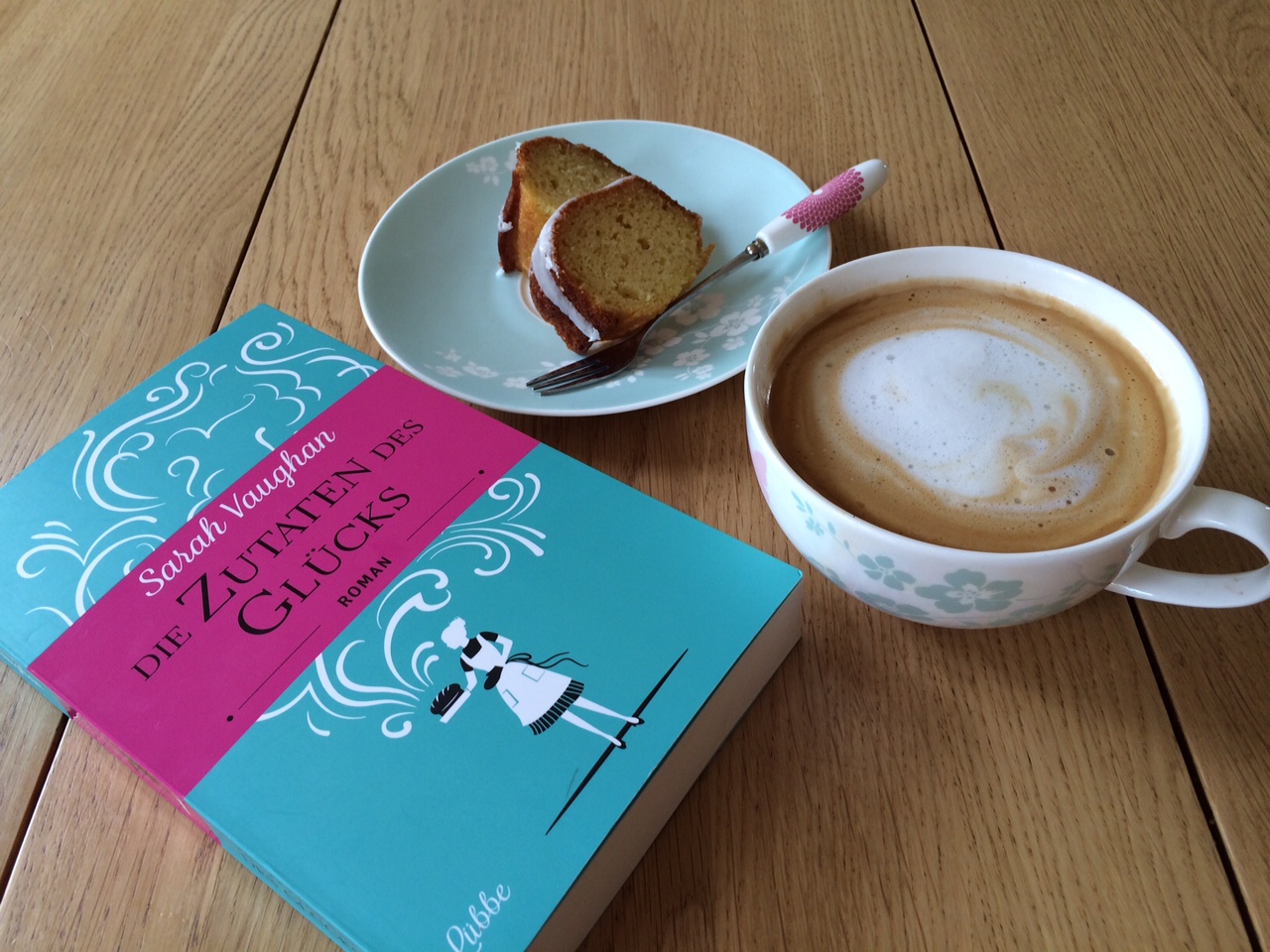
The Art of Baking Blind is published in Germany today as Die Zutaten des Glücks - or the rather lovely The Ingredients of Happiness. And as well as this being an opportunity to bake celebratory cheesecakes, black forest gateaux and my first ever bundt, it's made me contemplate fonts.

For while my German publisher Bastei Lübbe has used the same cover as Hodder, it departed from the original in using a different font for the sections in the past and a special letter-writing font for the one letter in the book.  I love the changes but it's made me think about how we view the typography of novels.

When I submitted The Art of Baking Blind to publishers, I used italics for the quotations from The Art of Baking, the vintage cookery book whose bon mots top each chapter. But I also used italics for the flashbacks that intersperse the present day plot, which concern the cookbook's author Kathleen Eaden and run from 1964-66.

I wanted to clearly convey that these sections belonged to a different time and also differed in style, being exclusively from Kathleen Eaden's point of view. They were the most intensely emotional parts of the book and although they complemented the present day plot could be read as an individual story. 

I hadn't considered, however, that while italics are routinely used to convey direct inner thoughts - most explicitly in a novel like Gone Girl - or for lists or letters, they signal to some readers that they can be skipped. The same could be said for any fonts used for meta-fiction. My 10-year-old, rereading the Harry Potter books, leaves out The Daily Prophet sections, the parts written in a heavy newspaper typeface. "They slow up the story," she explains. "My friends do it, too. We go back and re-read those sections if they're not explained later and we need to fill in the gaps."

None of this had occurred to me before Nina Stibbe, the bestselling author of Love, Nina and Man at the Helm, was kind enough to read a proof of my novel and pointed out the risks of sustained italicised sections. "I loved it but there's just one thing I don't like," she said. "The italics. You don't want people to skim them. Could you think about getting them changed?" 

She was so persuasive that we reverted to the usual font with the sections being headed Kathleen. Bastei Lübbe didn't want to use our formula but came up with an excellent alternative: not using italics but a font which differs distinctly from the Times New Roman or Cambria we are used to seeing as the usual types. It's a technique also used recently in Marian Keyes' bestselling The Woman Who Stole My Life, in which the present day sections are in a more modern font to the back story set four years previously. 

FullSizeRender-18.jpg


Bastei Lübbe also used a letter-writing font for the crucial letter on which Kathleen's story turns, which conjures up the era in which it was written, 1972: 

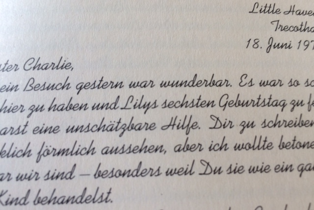
As Iris Gehrmann, editor of fiction, explains: "We chose a different font for the Kathleen passages to distinguish her perspective from those of the other characters in the book. And the special handwriting font used for Kathleen’s letter at the end of the book is supposed to emphasize the very personal character of the document and its nostalgic flair." 

All of which makes me wonder if I've become rather conservative not just in the way in which I react to fonts when reading but when writing. I tend to write in Times New Roman or Cambria, liking the implied authority and the way in which it is similar to the Sabon MT used by Hodder for my novel. In other words, the fact that it looks like a "proper" book. 

Some authors switch to different fonts to edit: the change flagging up errors or prompting them to read in a fresh way. "I change font when I'm line editing. I think it helps me to spot errors more easily if I'm staring at a different typeface," Joanna Cannon, author of The Trouble with Goats and Sheep, to be published in the New Year, explains. That works for me but an experiment in writing in Helvetica this week took me way out of my comfort zone. Nothing that I'd written read or sounded right.

Perhaps I could learn from my seven-year-old who enjoys books which eschew the formality of a traditional font or subvert it - such as Andy Stanton's Mr Gum books, in which smudged fingerprints or decreasing and increasing font sizes pepper the page - or which reject the authority of a typed text and appear to be handwritten.  "Why do you enjoy the Wimpy Kid books so much?" I ask my boy, as he pores over the latest instalment after reading Tom Gates. "Because there's more space around the words," he explains as if it is perfectly straightforward. "They're easier to read."

It seems I may have been too precious in my attitude to fonts. I tweet Marian Keyes to ask her about her use of them in The Woman Who Stole My Life and she quickly gets back to me. (She's fiendishly good at and prolific on twitter.) 

 "Why don't you play around with those available to you and see what ones appeal?" she asks - opening up all sorts of future possibilities. "Have fun with it."


On Cornwall and colour. Or the importance of a sense of place.

The author David Nicholls recently wrote  in The Guardian about the importance of visiting the places described in his novels. In a world in which we can click on google earth to research a spot, he argued for the need to visit the locations in which his fiction is set. I read the article en route to Bodmin moor - a 700-mile round trip from my Cambridgeshire home - and one of the settings of my next novel. A small part of me wondered if this was the ultimate in procrastination. Having come back newly inspired, I only wish I'd returned before.

My second book is set on a farm in north Cornwall, an area I know well having holidayed there each year since I was a child. But there's a section based on the moor and though I'd taken two trips down there in the past 12 months to interview octogenarian farmers and to visit its airfields, and raced over it for three decades, I hadn't explored it all. 

One of my characters embarks on a quest to find a half-remembered farmhouse and I couldn't get these scenes quite right, sitting at my desk at home. I hadn't captured the peculiar claustrophobia of high-banked hedgerows or of tiny villages hidden in the folds between tors. Nor was I sure about the smell: damp grass; musky bracken; honeyed gorse?  My character, an intrepid 83-year-old, gets lost, and it was clear I needed to do the same as her.

And so I did. For it's hard not to become disorientated when you're relying on signposts that turn in contradictory directions and interpreting a Cornish mile as, well, a mile. And then the mist came down. A mizzle that made it impossible to see the tors I was searching for; that seeped through my trainers and into my bones; that reminded me of quite how bleak and inhospitable any moor can become.

Daphne du Maurier came up with the idea of Jamaica Inn when she got lost in the mist while riding - just a few miles from where I was. And as I climbed out of tiny Blisland towards St Breward - the area in which Poldark's farmhouse in the recent BBC TV series was filmed - I became similarly disorientated by a visibility that, at best, was poor. Incapable of seeing any farmhouse, or even the track in front of me, I had to stop still. It was just me, the relentless rain, and some Highland Cattle grazing amongst the gorse.

I had wanted atmosphere; a sense of place that was almost tangible;  images which would fill my notepad and fuel me as I completed this tricky draft. And here it was. Shrouded in the mist, I scrawled furiously and, when it lifted, found that other famous du Maurier moorland setting, Altarnum.

The picturesque village clustered around an imposing granite church where her vicar caricatured his flock as sheep, who hung on his every word. The air was scented with wild garlic; the hedgerows stuffed with greater stitchworth; bluebells; buttercups and red campion. Mallards waddled towards allotments; rhododendrons bloomed. There was even a tiny village hall, fringing a brook that, yes, really did babble.

It was time to head out. Back to the wildness of the open moor. To an area at the heart of Cornwall and at the emotional tipping point of my novel. 

It's an expanse that brings back painful memories for my 83-year-old. Thanks to my return trip, I'm a little more confident about describing her experience.

Happy US publication day to The Art of Baking Blind.
11_18_ArtofBakingBlind.jpg

My novel about why we bake is published by St Martin's Press today - and it's a surreal but wonderful feeling: knowing that my book may be being picked up in bookshops so far away. 

St Martin's have also asked me to come up with some reading group questions and I found them a joy to write. Preoccupied with the redraft of my second novel, it was a delight to turn back to my first one and to lavish a little attention on it. I hope they prove useful. (And if any US readers have recipes for typically American bakes - pecan pie, pumpkin pie, whoopie pies perhaps - I'd love to hear about them.)

Reading group questions: (Note: spoilers.)

1. Blind baking is a technique for ensuring a perfect pastry case yet, as Jenny muses, "so much can go wrong." The impossibility of perfection is a major theme in this novel. Who, in your opinion, is the character that personifies this trait most clearly? And what lies behind the "be perfect" compulsion exhibited by many women.

2. The germ of this novel came when I started baking with my small children. At the same time, I noted the competitiveness of mothers running school cake sales. Is our interest in baking an expression of a hankering for a simpler, gentler - and perhaps fictitious - time? Or is it about a need for validation particularly among highly-educated, stay-at-home mothers?

3. At the heart of the book is the idea of family. For most of the women, baking or cooking represents the idea of "home" or an idealised home. Why do we invest food with such significance? And what do you think of the characters in the novel who fail to perceive food in this way?

4. Food can also be about control, as exemplified by Karen. What do you think of the portrayal of disordered eating in the novel? Is the portrayal sympathetic - do we understand Karen's behaviour?

5. "Things fall apart; the centre cannot hold." The Yeats' epigraph is recalled by Jenny as her sponge curdles and she thinks of her disintegrating marriage. Where else is baking used figuratively to represent personality traits or to mirror a character's experience?

6. Many of the women in the novel are struggling with a change in their lives and it's this dissatisfaction that leads them to apply for the competition. Jenny has lost her old role of wife and full-time mother; Karen is struggling with the idea that her body is ageing Vicki is struggling to adapt to being a stay-at-home mum who may only have one child. Only Claire - whose mother applies on her behalf - is not at such a crossroads. Does this make her a less dynamic; or less sympathetic, character? If not, why? 

7. Are there any characters you found unlikeable? If so, why?

8. Did you expect Kathleen's story to end as it did? Did you find that satisfying?

9. In my own family, we have passed down favourite recipes. What are yours and is there an equivalent of an Art of Baking in your life: the culinary Bible that has shaped the way you bake?


On why redrafting a novel is like doing your music practice

My ten-year-old is practising for a piano exam and finding it tricky. The Scarlatti Minuet is half-remembered: the bass line forgotten, the fingering more fiddly than before. She plays a couple of dramatic, minor chords then curves off the piano stool balletically. "I'm playing something else," she insists, as she hangs upside down.

And so she starts to learn an alternative piece: a perky Allegro by Clementi. C major and its related G major where the Scarlatti was C minor; a far easier to manage 4/4. Her fingers fly across the keys; the perfect cadences so much more automatic than the Scarlatti's dissonant, imperfect ones.

Her piano teacher wants her to persist with the more complex piece: the sad little melody that fills my head long after I've forgotten the anodyne, jaunty Clementi. And yet, to get it right, she will need to take it apart. She must rethink the fingering; make the rhythm precise; get the dynamics, the phrasing, the odd misremembered note absolutely secure.

I've been thinking a lot about this this week as I've plodded on, redrafting my second novel. For, panicked about my deadline, and knowing it wasn't right but not knowing how to fix it, I opted for a bit of Clementi: throwing bright jauntiness and some basic C major at a tale with a far darker heart. Luckily my clever editor was having none of it. She saw my discordant novel for what it  was: a draft in which one timeline - the bass, if you like; or the story that's set in the past - moves resolutely into a minor key - while the treble, or the present day story, insisted on chirping along in its major key, tone-deaf and oblivious to the darker, more interesting rumblings. Imagine playing two hands of the piano in different keys and that's effectively what you had.

Persisting with the Clementi-like plot was not an option and so I've been doing the equivalent of relearning the Scarlatti: though in my case this has meant not just developing characters and darkening plot strands but chucking out and rewriting 30,000 words. Interviewed by Rebecca Mascull last week, I talked about how I'd drawn up a grid for my first novel and seen the different plot lines interweaving polyphonically, like a Baroque counterpoint. This novel has a different structure, with distinct, more equally balanced past and present stories. I've worked relentlessly on the bass line - the past plot - and now it's the turn of the treble - or the present -  to sing just as sweetly but with more melancholy, more light and shade, than before. 

For getting this second novel right matters immensely and so I push on, worrying away at the rhythm of paragraphs and the freshness of the imagery; checking that a character is psychologically consistent. Fretting about pace; and tension; and balance -  just as I once practised my flute obsessively, for hour after hour. 

My daughter is back at the piano stool, scrutinising the Scarlatti. And tentatively, she plays first the right hand, then the left one. Rethinking, relearning. Figuring it all out, once more.


Sarah Vaughan Comment